Article Summary
Figma Config 2025 was ten thousand people, a schedule too dense to fully attend, and a wall of AI that left the room exhausted. The talks that stuck with us had almost nothing to do with the newest tool and everything to do with a point of view about how design should work. For a B2B shop, that distinction is the whole game.
Key Takeaways
Related Video
Full Article
Config is still worth the trip
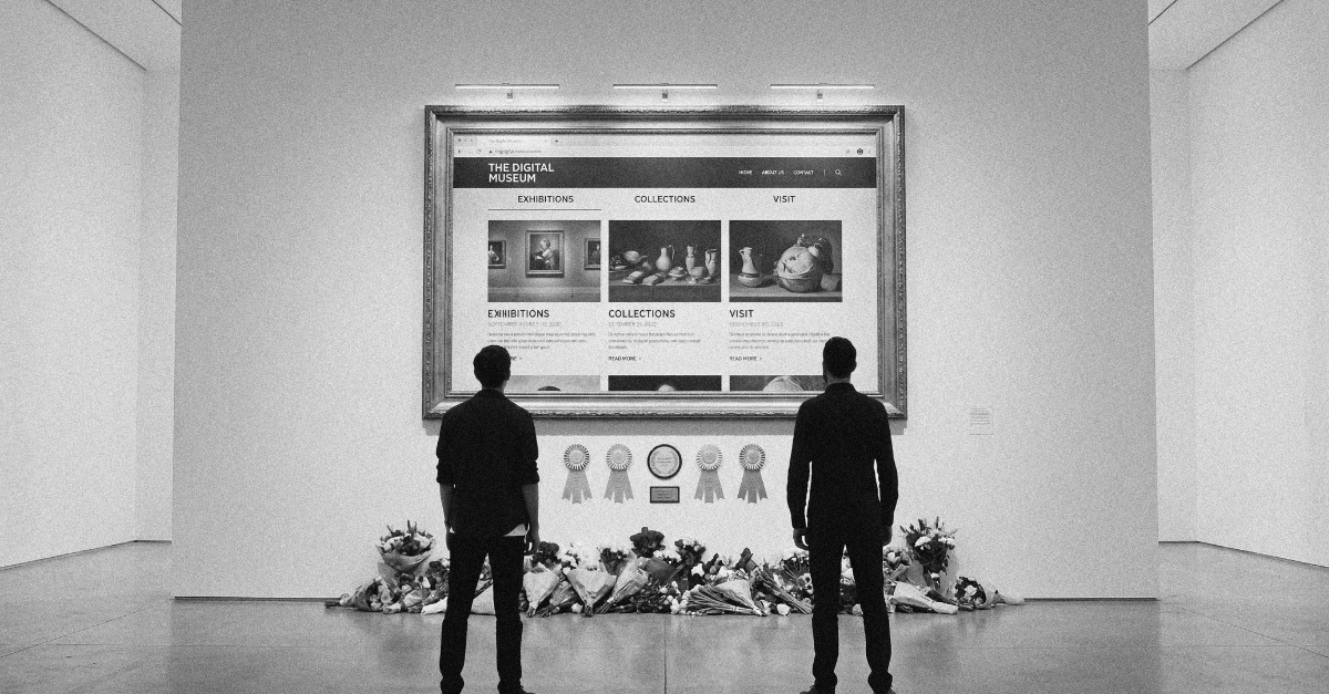
Every year Figma Config gets a little bigger and a little louder. Ten thousand people, a schedule so dense you can attend only a fraction of it, and this year, a wall of AI. It was our second year going, and the scale still lands as unreal. There's nothing comparable in Toronto. RGD Design Thinkers is great but not digital focused. Tech Week isn't design focused. Web Summit left for Vancouver. Which is either a gap in the market or an opportunity for an agency to build something small that grows over time. (Figma, if you're reading this, Toronto would host your international one nicely).
The value of going is twofold. You get a window into where the design industry thinks it's heading, and you get the art-based practitioners whose talks are just personally inspiring. This year hit both, once you got past the acronym.
Because the AI was a lot. It got exhausting by the end of the first day. The second day opened up more room to explore work outside that focus, and the relief was audible. At one point a presenter said their talk had nothing to do with AI, and the crowd clapped. That reaction is worth sitting with. The exhaustion wasn't anti-technology. It was a hunger for something the demos mostly weren't offering: a point of view.
In hindsight, Figma seemed to read the room. Their keynote released a stack of features, but the AI piece, the agents, took a back seat. They're there, they're useful, they got mentioned. But the company didn't lean into them the way it did in 2024, when the product release was largely AI tooling. That restraint felt deliberate.
The talks that landed hardest weren't the ones showing off the newest tool. They were the ones making an argument about how design should work. Here are the ideas we brought back.
Taste comes from the people you're responsible for
Anna Oh works in robotics for seniors, applying product and UX thinking to hardware inside the healthcare system. Her line that stuck: taste doesn't come from the design community, it comes from the people you're responsible for.
For anyone building for businesses, this is a useful correction. It's easy to chase what looks impressive to other designers. But good design survives its context. The goal isn't the flashiest execution, it's designing for the actual purpose and the actual audience. Hearing that from someone coming at it from hardware and healthcare, a completely different direction than a typical software team, made it land harder.
Density is a measure of usefulness
Matthew Ström-Awn, a designer from Stripe, gave a talk on density that turned into something bigger. His framing borrowed from Edward Tufte's ink-to-paper ratio: for every unit of ink on the page, there should be a matching unit of meaning. More ink and less meaning is a bad ratio. Less ink and more meaning is the goal.
Applied to interfaces, this becomes a clean evaluation tool. Look at any screen and ask how much of it is actually serving a purpose. A dense, feature-rich interface isn't automatically worse. It can be more useful, as long as everything earns its place. He extended the idea across static density, motion and time-based density, and informational density, which is a practical lens for the interface and web work we do every day. Is this element carrying meaning, or is it fluff?
The talk had a "secret second talk" underneath it, as he put it. His real argument: we don't have a craft problem, we have a problem of talking about craft too much. The answers already exist. We're fixated on the wrong things. His opening anecdote made the point. A client came to him wanting a dashboard modeled on an investing app, a request he could have dismissed. Instead he argued you should prove the question is a bad idea before dismissing it. That research led him somewhere he never would have gone otherwise. For an agency fielding client requests all day, that's a discipline worth building.
Designing for a car with no driver
Ryan Powell's talk on Waymo was one of the more fascinating product design cases at the conference. The core problem: how do you design the experience when you remove the driver, and with them all the small human communication that comes standard in a car?
The findings were the interesting part. Early passengers felt safe almost instinctively, in an environment where you'd expect the opposite from a brand-new experience. And the team leaned on psychoacoustics to get there, using the note E throughout the ride because of its association with calmness. It's a small detail that makes a real difference to how the space feels. A reminder that in product design the emotional layer is doing quiet work most people never notice.
Street art as a living design system
Ella Rochelle-Lawton, who started in the circus and community arts world, talked about street art as a design system. Concrete and spray paint, the mediums themselves, become components in a system that lives out in public rather than in a file.
The part we'd like to dig into further was her research on how murals and street art affect communities, with real data showing measurable improvement in neighborhoods that have them. Design systems aren't only an internal efficiency tool. They're a way of thinking that scales to almost anything.
Designing so people can leave
Jésabel DC's talk on low-tech lessons from the early 2000s was the most quietly radical. Her argument: design in the 2000s wasn't better because designers had better values. It was better because no business model yet paid anyone to trap you in an app. Then attention became the product, and we got infinite scroll and everything that came with it. She also pointed out that disorientation in modern apps is a feature, not a flaw, because a disoriented user is a dependent one.
Her examples were sharp. Lego tests the instructional design of every set, and the moment a kit can't be assembled without text, they redesign the whole thing. Animal Crossing ties to the clock on your Switch, and because almost nothing happens at night, the game gives you a reason to stop playing. Nintendo already made its money when you bought the game, so it has no need to hold you captive.
For a shop that builds things for businesses, this is a values question worth asking on every project: are we designing for the client's user, or designing to extract from them?
Language is design
Chelsea Larsson from Anthropic spoke on language as design, and it may be the most relevant talk for where the industry is heading. Content has always been design, but as more of how people experience software shifts to language, especially with AI, it becomes fundamental. People interact with these systems by writing to them. The clicks and the intuitive stuff matter less than how clearly you explain things in words, how the system writes back, and how people are meant to write to it.
She had a concrete example. When migrating data between ChatGPT and Claude, a prompt written as a blunt directive could read as a jailbreak attempt and trip the safety mechanisms, so it wouldn't hand over enough to complete the import. The wording itself changed the outcome.
Her best reframe was on how we talk about AI. Everyone reaches for the Industrial Revolution comparison. She reached for cars instead. We designed cars, then designed the whole environment around cars instead of humans, and that's what we lost. Language and design encode values the same way. Where we go from here is a choice.
So, is Config still worth it?
Yes. The AI fatigue was real, and there were some genuinely weak talks. But the conference remains a window into where design is heading, and the best sessions had almost nothing to do with the tools and everything to do with judgment. That's the part of design that matters most when you're building for businesses, and it's the part that doesn't get automated away.
Final verdict from the team: 9 / 9 / 9.5
More Reading?
Take a look at some of our personal LinkedIn articles on this for some different or overlapping perspectives.
Frequently Asked Questions (FAQ)
What was the single most useful idea for a B2B design team?
Matthew Ström-Awn's density framing. Treating every screen element as needing to earn its place, with a matching unit of meaning for every unit of visual weight, gives you a fast, repeatable way to evaluate whether an interface is doing real work or just adding fluff.
What did the Waymo talk actually teach about product design?
That the emotional layer of an experience does quiet, measurable work. Ryan Powell described how early passengers felt safe almost instinctively, and how the team used psychoacoustics, including the calming note E, to shape that feeling. It's a good example of design decisions users never consciously notice but still respond to.
Is a design conference like Config worth it for an agency rather than a product team?
For us, yes, though the value isn't in the tool demos. It's in the exposure to how sophisticated practitioners think about judgment, craft, and where the industry is going. Those are the parts of the work that separate good agencies from order-takers, and they don't get automated away.
Why does "language is design" matter more now?
Because more of how people experience software is shifting to language, especially with AI, where the entire interaction can be written back and forth. How clearly a system explains itself, and how it interprets what a user writes, increasingly shapes the whole experience. Content was always design; it's just harder to ignore now.