Article Summary
A lot of design looks the same right now, and everyone wants to blame AI. But AI is doing what plenty of designers already do: pulling from a reference library made entirely of other design, and handing back the average. The way out is not to remix less. It is to remix from further away.
Key Takeaways
- AI-generated design looks the same because a model pulls from the statistical middle of its training data. It gives you the most common answer, every time.
- If your only reference library is other design, you are running the same program as the machine, just slower.
- Everything is a remix. That is not a criticism of the profession, it is how the profession has always worked.
- The designers worth studying made creative leaps into other fields entirely: medicine, engineering, printmaking.
- Dribbble, Mobbin, and design systems are great for getting off the ground. They are terrible for exploration, because they collapse the possibilities down to what already exists.
- You will never out-average the average machine. The part that is still ours is the leap into somewhere strange.
Related Video
Full Article
A lot of design looks the same right now, and everyone wants to blame AI for it. I get the instinct. But AI is doing the exact same thing a lot of designers do, and have always done. It looks at everything that already exists, and it hands you the average of it.
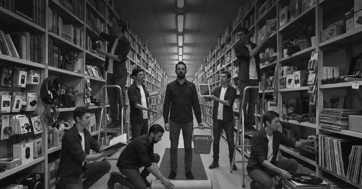
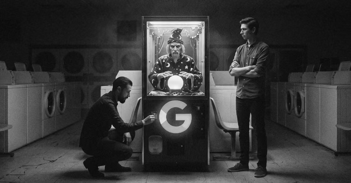
That is worth sitting with if you are trying to work out why so much of this work converges from one tool to the next. A model pulls from the middle. It pulls from the most common material it was trained on, so it trends toward the generic by default. It is remixing the average, so it hands you the average back. Here is the uncomfortable part: if your only reference library is other design, you are essentially running the same program. Just a lot slower.
Everything is a remix. I do not mean that as an insult to the work. It is genuinely how things work, and how the profession has always worked. Kirby Ferguson built a whole series on this idea over a decade ago, and the argument still holds up. From cave paintings to Bowie to hip-hop, there is a lineage to everything anyone has ever made. Copied, transformed, recombined. Originality was never about inventing from nothing, it was about the distance between the things you pulled together. We are not as special as we like to think, and I find that freeing rather than depressing.
And yes, I know AI was trained on our work without asking. It scraped everything, no consent, no checks. That point is not lost on me, and the first big settlements are only starting to move through the courts now. Both things can be true. The training was done without permission, and the underlying mechanic, remixing what came before, is something designers have done forever. The difference is only ever where you pull from.
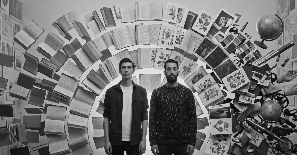
So the edge was never that you should not remix. We borrow from everywhere, and that is the point. The best designers in history, and some of the best non-designers who accidentally became designers, borrowed from the strangest places they could find. Three of them are worth your time.
Exhibit one: a doctor who borrowed from cartography
John Snow, London, 1854. Not the one from television. Cholera was killing people across Soho and nobody knew why. The running theory of the day was bad air, and germ theory did not exist yet. Snow, a physician, thought the cause was in the water instead, but he could not prove it because the thing he was chasing was invisible.
So he borrowed an idea from cartography. He took a map of the neighborhood around Broad Street and marked every cholera death as a small bar on the street where it happened. Zoom out, and the deaths cluster hard around a single water pump. It is widely regarded as one of the earliest real examples of data visualization, and it was made by a doctor who was not trying to make a chart. He was trying to win an argument, and the design was a side effect of needing to convince people.
The tidy version of the story says he removed the pump handle and the deaths stopped. Read a little deeper and it is messier than that. The deaths were already declining, partly because people had fled the neighborhood. Take from that what you want. It is still a clean case study in making a creative leap out of your own discipline and into someone else's.
Exhibit two: an engineer who borrowed from circuit diagrams
Harry Beck, same city, roughly eighty years later. The London Underground map at the time was a geographic mess. It was accurate to a fault, which meant a tangle of station names crammed into the center and a river running through the middle of a subway map. Technically correct, practically useless.
Beck was an engineering draughtsman in the Underground's own signals office. He drew electrical circuit schematics for a living, got laid off in 1931, and redrew the map in his spare time. His leap was the opposite of Snow's. Where Snow added geography, Beck stripped it out. Passengers are underground. They do not care about the real distance between stops or where the river runs. They care about which line to take and where to change. What came out of that was a diagram of clean straight lines and forty-five degree angles that basically every transit map on earth now copies.
I will be honest about the myth here, because it matters to the point. Every design video online will tell you the map was a one-to-one translation of a circuit diagram. Some historians push back on the neat single-genius version and note that his map also built on earlier attempts to make the Underground more diagrammatic. But Beck drew circuits for years, and Transport for London itself credits the connection. Whatever the exact chain of influence, a person who spent his days drawing wiring looked at a subway map and saw a circuit. That is the leap.
Exhibit three: a designer who followed the material
Karel Martens, a Dutch graphic designer, still working, in his eighties. He trained as an artist back when graphic design was not even its own field of study yet, which is part of the point. His leap was not into another profession. It was into the junk around his own studio.
Martens is a lifelong printmaker. At some point he stopped reaching only for type and started pulling prints from found objects instead. Scavenged bits of metal, machine parts, washers, discarded car parts, even his kids' old Meccano sets, inked and pressed onto found paper like old museum record cards headed for the trash. The results, made decades ago, are almost indistinguishable from work you would call contemporary today. Genuinely non-derivative, and it came from looking past his existing tools and asking a simple question: what else is in this room, and what happens if I print with it?
If you know me, you know I love a readymade. Big Duchamp fan. And I think we need more of that instinct right now, conceptual and tangible both, because everything is a remix whether a person is doing it or a machine is. The question is only ever how far you are willing to reach.
Where this leaves us
Three people, three ways to borrow. Snow took a method from another field. Beck took the visual logic of another material and abstracted it. Martens took the problem and followed the material wherever it went. Not one of them found their idea by looking at other design. None of them drew a tight boundary around what the future of the design industry was allowed to be.
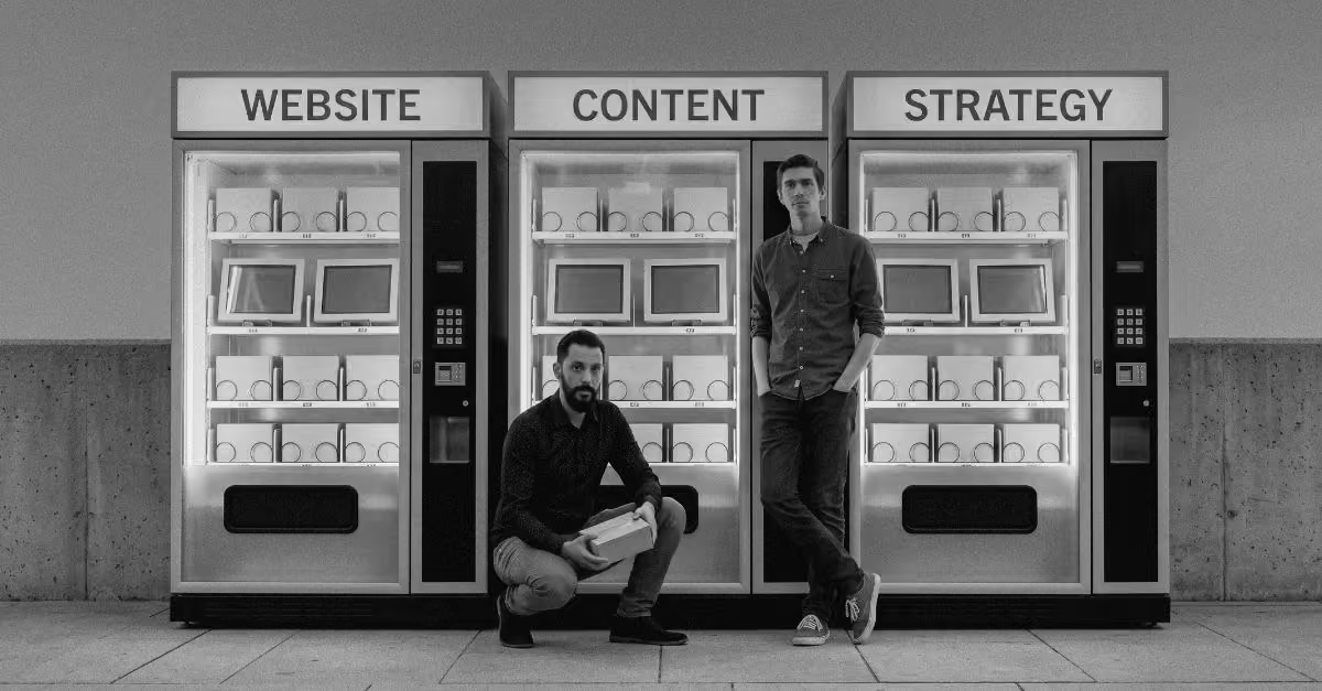
That is the whole thing. If you draw that boundary, you are in a race to the average, and you might as well let the machine run it for you. If you live your working life on Dribbble and Mobbin, you collapse the possibilities down to what already exists. Those tools are great for getting a project off the ground. Design systems are great for the same reason. But they are built to converge, not to explore, and exploration is the part that was ever yours to begin with, especially as design becomes an integrated, data-driven process.
You are never going to out-average the average machine. The only way out is to borrow from further and further away. That distance is where originality actually comes from, and it is the one part of creativity a model cannot reach. AI cannot go stand somewhere strange and come back with something new. It can only recombine what it already holds.
Standing somewhere strange is still our job.
Frequently Asked Questions (FAQ)
Why does so much AI design look the same?
Because generative models are built to return the statistical average of their training data. When you give a model a common prompt, it reaches for the most likely response, which tends to be the most common one. The result is competent, safe, and nearly identical across tools and users.
Will AI make everything look the same?
Only if we let our reference libraries shrink to match the machine's. AI converges on the average, but people do not have to. The designers who stand out will be the ones borrowing from outside design entirely, from other fields, other materials, other disciplines the model was never pointed at.
Is it a problem that AI was trained on designers' work without consent?
Yes, and that is a real issue moving through the courts now. It is also separate from the creative question. You can object to how these models were trained and still recognize that remixing prior work is something the profession has always done. Both things hold at once.
Does "everything is a remix" mean originality is dead?
No. It means originality was never about inventing from nothing. Every artist works from references. It comes from the distance between those references, not the absence of them. The further apart the things you combine, the more original the result feels.
Are tools like Dribbble and Mobbin bad for designers?
Not bad, just limited. They are excellent for orienting quickly and getting a project moving, because they show you what already works. The catch is that they only show you what already exists, so leaning on them for exploration quietly narrows what you think is possible.
How do I actually get more original results, with or without AI?
Widen your inputs. Study things that have nothing to do with design: how a discipline you know nothing about solves its problems, how a physical material behaves, how a completely different field visualizes its data. The creative leap comes from carrying an idea across that gap, which is the one thing a model cannot do for you.