
Article Summary
Key Takeaways
Full Article
Our last toolkit was a great introduction to data and data visualization. It’s a rich history that has been branching off into many fields and specialized disciplines. My business partner and I had their start in datavis and that has since evolved into methodologies that inform our human-centered design approach.
Since Jacques Bertin’s monumental work Semiologie Graphique in 1967, data visualization was largely confined to academic or niche outcomes. Yes, there were absolutely more editorial uses of datavis, but it was very far from the more public facing, and democratized entity of what datavis is presently.
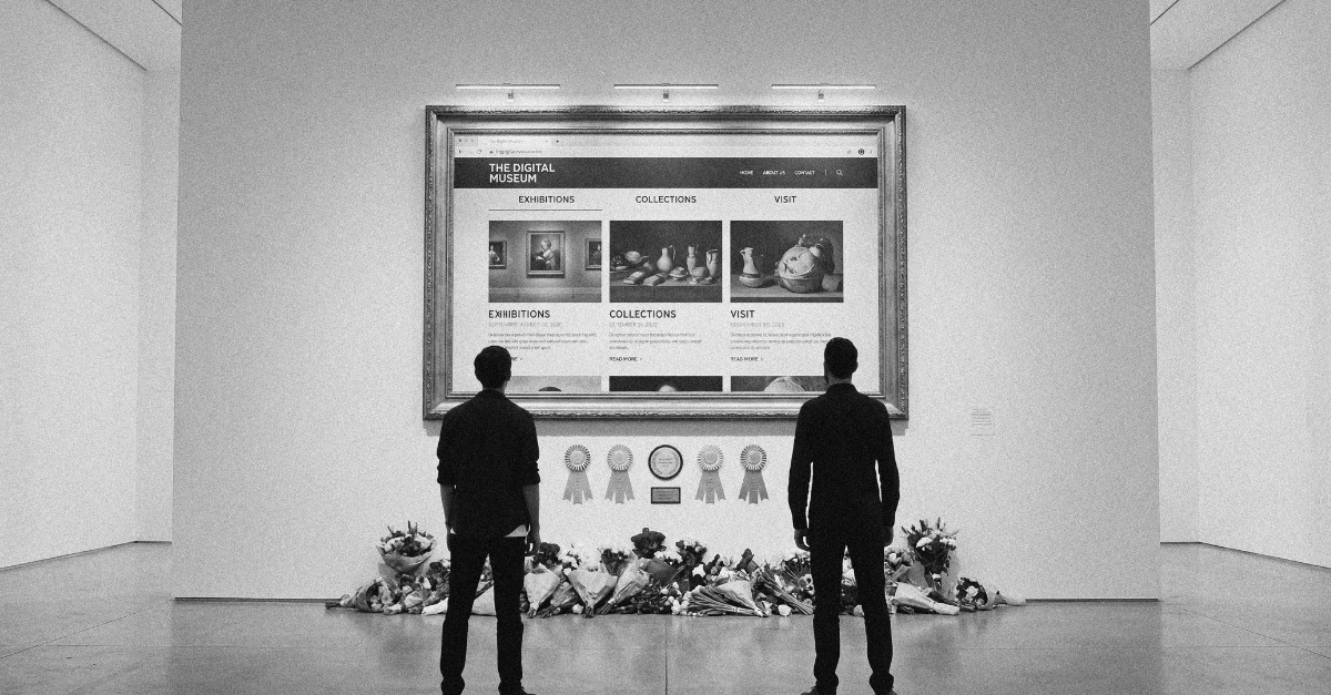
Visualization started to become popularized in design circles during the early 2000s. What followed was an explosion of tools to make it easier for designers to create visualizations. This newfound agency to create data-driven work drove a need for more publicly accessible datasets. This data ranged from weather data, city data like Open Data Toronto, or United Nations data found at data.un.org.
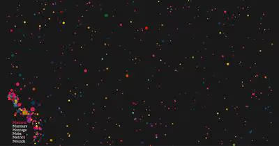
These datasets were massive repositories of quantitative data—interesting to visualize, but lacking a human edge. Designers such as Jonathan Harris, Nicholas Felton, and many others took a different route; they built their own datasets from either user-generated or self-reported data. Their outcomes from this work were as engaging as they were empathic.
Jonthan Harris delivered We Feel Fine, which was a website that collected user-generated content about how they felt—it also helped that this was a TED Talk. The visualization was a beautiful exploration of emotions and new ways to visualize qualitative data. This project added a bit of a voyeuristic angle to datavis, allowing strangers to explore the emotions of others, far removed from the emotion itself. It was also one of the early web-based datavis projects that showed the power of the web for animation and interaction.
Next up we have the Feltron Reports, put out by Nicholas Felton. These reports were annual reports about his everyday life. How much he walked, drank, slept, exercised—banal everyday kind of data. His last one was in
2014 (RIP Feltron Reports, you did good). Felton and Ryan Case would eventually create Daytum, which was a social network for people to publicly share their own banal everyday kind of data. Users would share some oddly personal datasets—my favourite is Hair Everywhere or Movies My Kid Makes Me Watch.

These projects were inspirational at the time, but most importantly they showed us a new type of dataset and the power of visualizing qualitative data. These works gave us permission to browse the data of strangers, opening up opportunities for reflection and empathy.
This new perspective on data and empathy in datavis has been echoed by much of the literature on human-centered design methods. Design methods generate a large amount of qualitative data, which can be a powerful tool when used in conjunction with datavis. In our case, this data is stakeholder interview transcripts, surveys, or quantitative data. The collection of qualitative and quantitative is an important step in our discovery stages.
A proper discovery stage is about removing the complexity by gathering raw materials and synthesizing a roadmap. However, the quality of most design outcomes is largely dependent on the quality of the starting materials. Bad stakeholder interviews, insufficient data, or bad-data (ie. biased) can negatively impact the design process down the line with false-positives or -negatives. One way around this is to collect data in a consistent design research framework.
There are plenty of research methods to help facilitate the collection of data, and your choices will also influence the data you receive. It helps to know what tools you have at your disposal—and there is a lot to choose from. Here is a tool we love—and helped to create Design Research Techniques; It’s an online meta-analysis of design research techniques.
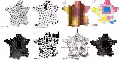
To really explore the data you need to break it apart, and put it back together in different ways.
Collecting data should only be considered the first step. As seen in the Feltron Reports, or We Feel Fine, qualitative data can become something new that offers a multitude of perspectives. Your data might be sacred, but it’s also a material that can be experimented with. Visualizing discovery data does not need to look as flashy as the Feltron Reports, a simple bar graph of word frequency, a pie-chart of emotions, a social network graph, or the loathed word-cloud. Visualizing is synthesizing a new material, and this allows you to compare qualitative on a quantitative level, offering a different perspective.
By approaching each engagement with human-centered design methods in conjunction with visualization, our design stages are better equipped to deliver successful solutions. Working with this in mind can yield design outcomes that have deeper user engagement, less friction, and more nuanced personalization. It’s important to remember that the quality of most design outcomes is largely dependent on the quality of the starting materials.